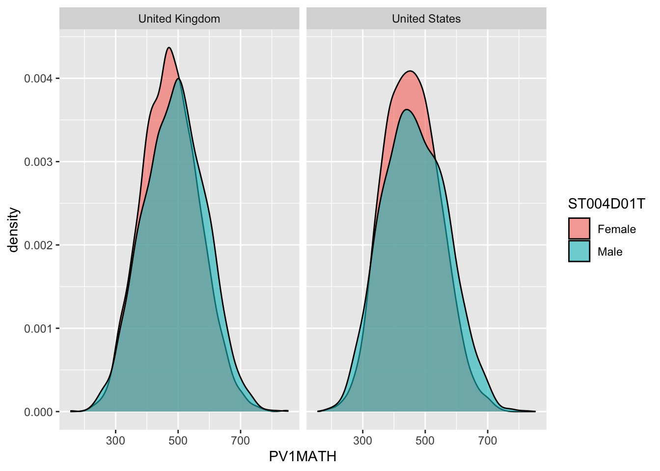
Each part of the graph has hill-shaped lines, one in pink and one in teal, representing the students’ math scores. The pink lines represent the female students, and the teal line shows the results for male students (no gender bias here – intentionally!).
The x-axis shows the math scores, and the y-axis shows the density. A higher up on the axis would mean that more students go that score. Both countries show a similar distribution, clustering around the range’s middle. In both the UK and the US, the peaks of the male density curves are very close, suggesting that the average math scores for both genders are similar. The spread of the scores (from the lowest to the highest) seems similar for both genders in each country, meaning there’s a similar range of performance within both genders. There is also a significant overlap between the scores for males and females, which indicates that many students from both genders have similar math performances.
The graph doesn’t show a stark difference between the two countries based on the density peaks; both countries have their peaks at a similar score range, indicating comparable average math abilities.