Welcome To STEM MA Quantitative methods in Educational Research Blog
news
Author
Richard Brock and Peter Kemp
Published
November 23, 2023
We will use this blog to display student work from the MA STEM Quantitative methods in Educational Research module at King’s College London. You can see the course book here MASTEMR
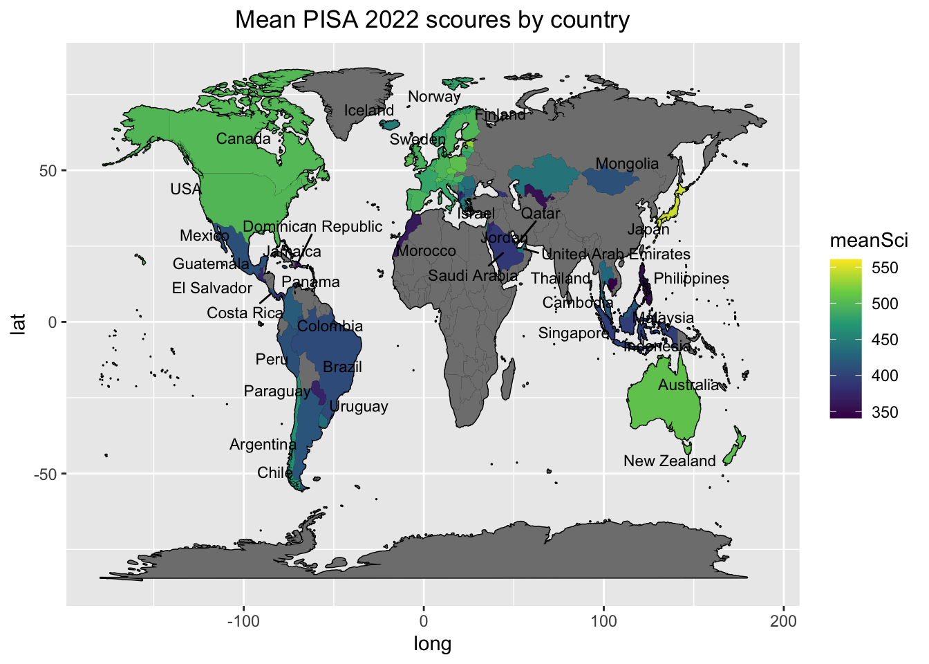
# Create a dataframe of country latitude and longitude dataworld_data <-map_data(map="world")# Create a dataframe of mean PISA science scores, and rename CNT to region# for the leftjoin mergining of dataframesWorldSci <- PISA_2022 %>%select(CNT, PV1SCIE) %>%group_by(CNT) %>%summarise(meanSci =mean(PV1SCIE)) %>%rename(region = CNT)levels(WorldSci$region)[levels(WorldSci$region)=="United Kingdom"] <-"UK"levels(WorldSci$region)[levels(WorldSci$region)=="United States"] <-"USA"Viet<-PISA_2022%>%select(PV1SCIE, CNT)%>%filter(CNT=="Vietnam")# Add the country latitude and longitude data to the PISA scoresWorldSci<-left_join(world_data, WorldSci, by="region")# Use geom_map to plot the basic world map (fill is white, line colour is black)# Use geom_polygon to plot the PISA data# Add a colour scaleLabels<-WorldSci%>%group_by(region)%>%summarise(meanSci=mean(meanSci), lat=mean(lat), long=mean(long))%>%na.omit()ggplot(data = WorldSci, aes(x=long, y=lat, group=group)) +geom_map(data=world_data, map=world_data, aes(map_id=region), fill="white", colour="black")+geom_polygon(aes(fill=meanSci)) +scale_fill_viridis_c(option ="viridis")+geom_text_repel(data=Labels, inherit.aes = F, aes(x=long, y=lat,label=region),size=3)+ggtitle("Mean PISA 2022 scoures by country")+theme(plot.title =element_text(hjust =0.5))