Welcome To STEM MA Quantitative methods in Educational Research Blog 2025
news
Author
Richard Brock and Peter Kemp
Published
October 22, 2024
Welcome to the 2025 STEM MA Quantitative methods in Educational Research Blog. Following the success of the blog last year we will continue to use the blog to publish student work from the MA module Quantitative methods in Educational Research. You can see the course book here MASTEMR
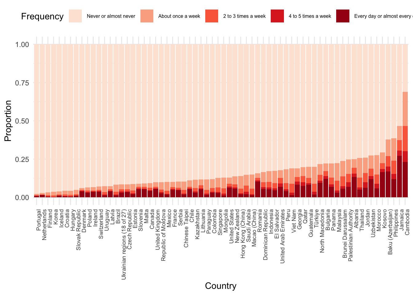
An example: Food poverty and achievement in PISA 2022 data
An item on the PISA 2022 survey (ST258Q01JA) asked respondents: “In the past 30 days, how often did you not eat because there was not enough money to buy food?” giving the following response options:
The missing responses were removed and the number of responses in the other categories counted and plotted by country.
PISA_2022_food_poverty <- PISA_2022 %>%select(ST258Q01JA, CNT) %>%filter(!is.na(ST258Q01JA))never_counts <- PISA_2022_food_poverty %>%group_by(CNT, ST258Q01JA) %>%summarise(n =n()) %>%mutate(prop_never = n /sum(n)) %>%filter(ST258Q01JA =="Never or almost never") %>%select(CNT, prop_never) plot_data <- PISA_2022_food_poverty %>%group_by(CNT, ST258Q01JA) %>%summarise(n =n()) %>%mutate(prop = n /sum(n)) %>%left_join(never_counts, by ="CNT") %>%mutate(CNT =factor(CNT, levels = never_counts$CNT[order(-never_counts$prop_never)])) %>%filter(!is.na(CNT))ggplot(plot_data, aes(x = CNT, y = prop, fill = ST258Q01JA)) +geom_bar(stat ="identity") +labs(x ="Country", y ="Proportion", fill ="Frequency") +theme_minimal() +theme(axis.text.x =element_text(angle =90, hjust =1, size =7)) +scale_fill_brewer(palette ="Reds") +theme(legend.position ="top", legend.text =element_text(size =6))
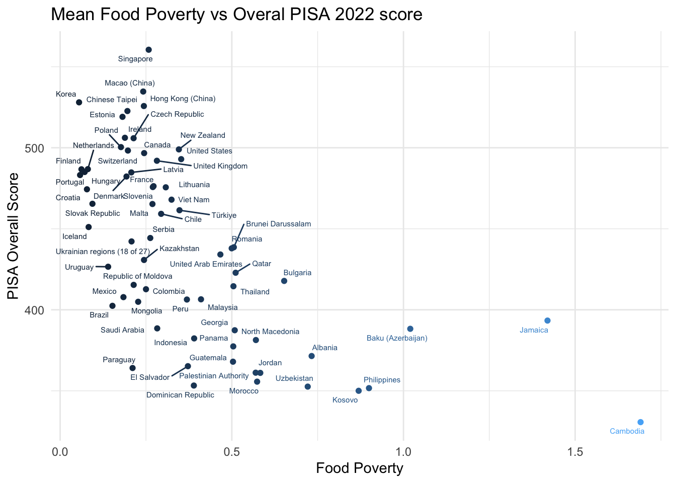
The mean achievement score (across reading, science and mathematics) was calculated for each country and a mean food poverty score created (Where, “Never or almost never” ~ 0, “About once a week” ~ 1, …. “Every day or almost every day” ~ 4). The relationship between the mean food poverty score and the mean achievement score was then plotted by country.
PISA_2022_food_poverty <- PISA_2022 %>%select(ST258Q01JA, PV1SCIE, PV1MATH, PV1READ, CNT) %>%filter(!is.na(ST258Q01JA)) %>%mutate(pv_overall = (PV1SCIE + PV1MATH + PV1READ) /3) %>%mutate(food_poverty =case_when( ST258Q01JA =="Never or almost never"~0, ST258Q01JA =="About once a week"~1, ST258Q01JA =="2 to 3 times a week"~2, ST258Q01JA =="4 to 5 times a week"~3, ST258Q01JA =="Every day or almost every day"~4,.default =NA )) %>%group_by(CNT) %>%summarise(mean_pv_overall =mean(pv_overall), mean_food_poverty =mean(food_poverty))ggplot(PISA_2022_food_poverty, aes(y = mean_pv_overall, x = mean_food_poverty, colour = mean_food_poverty)) +geom_point() +geom_text_repel(aes(label = CNT), size =2) +labs(title ="Mean Food Poverty vs Overal PISA 2022 score", y ="PISA Overall Score", x ="Food Poverty") +theme_minimal() +theme(legend.position ="none")
The plot shows a broadly negative relationship between food poverty and achievement score, with countries with higher food poverty scores having lower achievement scores. The plot also shows that there is a wide range of achievement scores for countries with the same food poverty score, suggesting that other factors are also important in determining achievement scores.